Friday, February 27, 2009

Gwen Kereval

I just found this illustrator's website whose work I really really like! Her name's Gwen Kereval and she's French, and does stuff for children's books and publications. Have a look at her groovy stuff.


I love it so much, she uses colours and line really awesomely. I'm guessing they were made in Illustrator. Sweeet!!

Thursday, February 26, 2009

Some truths

This is something I found on Stephan Silver's blog, and he found it somewhere else on the internet. I think it's really awesome, and whenever I feel a bit down about what I'm doing it always manages to cheer me up.

I haven't copy-pasted, but typed it out so that I can drill it into my head a bit more.

  • Ignore everybody.
  • The idea doesn't have to be big. It just has to be yours.
  • Put the hours in.
  • If your biz plan depends on you suddenly being "discovered" by some big shot, your plan will probably fail.
  • You are responsible for your own experience.
  • Everyone is born creative. Everyone is given a box of crayons in Kindergarten.
  • Keep your day job.
  • Companies that squelch creativity can no longer compete with those that champion it.
  • Everyone has their own Mount Everest they were put on this earth to climb.
  • The more talented somebody is, the less they need props.
  • Don't try to stand out from the crowd. Avoid crowds altogether.
  • If you accept the pain, it cannot hurt you.
  • Never compare your inside to somebody's outside.
  • Dying young is overrated.
  • The most important thing a creative person can learn professionally is where to draw the red line that separates what you are willing to do, and what you are not.
  • The world is changing.
  • Merit can be bought. Passion can't.
  • Avoid the watercooler gang.
  • Sing in your own voice.
  • The choice of media is irrelevent.
  • Selling out is harder than it looks.
  • Nobody cares. Do it for yourself.
  • Worrying about "Commercial vs Artistic" is a complete waste of time.
  • Don't worry about finding inspiration. It comes eventually.
  • You have to find your own schtick.
  • Write from the heart.
  • The best way to get approval is to not need it.
  • Power is never given. Power is taken.
  • Whatever choice you make, the Devil gets his due eventually.
  • The hardest part of being creative is getting used to it.
  • Remain frugal.
  • Allow your work to age with you.
  • Being poor sucks.
  • Beware of turning hobbies into jobs.
  • Savor obscurity while it lasts.
  • Start blogging!

The one that stands out most to me is this one.

You are responsible for your own experience.

I learned this lesson after wasting 2 years in a visual arts course expecting everything to be handed to me. I was stubborn and my mind was closed. Now I know, as the old saying goes, you get out what you put in. This is exceptionally true in art school.

I'm going to give it everything I've got this year. Starting.......... now.

Okay, gotta go draw. Seeya!

Tuesday, February 24, 2009

Steaky Croc

Today we went into the city to see some very interesting things. First we paid a visit to the Malthouse theatres and we got to peek into the workshop where they are currently building the set for a show called Goodbye Vaudeville, Charlie Mudd, which we are seeing in a few weeks time. We also got to see the set for Woyzeck, which was amazing, and I wish I had time to see the actual show but it closes this Saturday.

After that we went to the ACCA and saw a show called The Waterhole. Exhibitions at the ACCA are always a unique experience - this one in particular was pretty fun to go through.

Here's some developmental stuff for our next brief, which is to create a character and do 3 different illustrations of it. There's a theme to each one. My character of choice is Steaky, a crocodile I made up when I was like 10. He's lost a lot of weight since I last drew him. He also has friends, Mr Bear, whose past is a mystery, and Amputee Elephant, who endured a rather unfortunate accident in his younger days but makes do with an exceptionally exquisite trunk.


Saturday, February 21, 2009

Book Cover Final

I think I'm pretty happy with it but it looks a bit tackier than I thought it would be. Sadly, I am not a fantastic designer, though I wish I was. Great design makes me happy.

Friday, February 20, 2009

10 10 10!!!!

After a nice morning out shopping with mum, I did some more work on my Books Alive cover. The book's title is quite long - '10 Short Stories you Must Read This Year'. With a title like this, you really have to think a lot about hierarchy and the way the text is arranged on the page. If all of the text is treated equally, the importance of certain words is lost, and it doesn't have much of an impact on the viewer. If some of the text is too small or faint or hard to see, it becomes unbalanced and confusing.

The most important part of this title is '10', followed closely by 'short stories'. That's what this book is - a compilation of short stories, duh! Also, I placed emphasis on the word 'must'. Because it's a strong word and I felt I should treat it that way. And although it isn't capitolised, it's still stronger than the following words. You MUST read these stories. You must read these stories.

All that is left to do basically is the illustration of the owls, which I've decided will also be done in Photoshop. I really want to give this illo a real retro cartoon character look - solid, clean lines and sort of a silk-screen printed look.


This was a fun part - making the text pretty. For this design it was really imperitive that the title of the book was as much a piece of artwork as the rest of it. I used a cool font called 'Big Top' for the number 10, and then decorated it some more. They key to this is clever use of the Selection and Stroke tools:

  • select the 10
  • create a new layer
  • modify > contract the selection by about 20 pixels or so
  • use the Stroke tool, be sure the stroke is located INSIDE the selection
  • repeat and experiment with various weights and colours
  • and remember to create a new layer for each thing you do so you don't ruin anything you like!
I hope that makes sense. Here's a bit of a step-by-step series to give you an idea of what I did.


Thursday, February 19, 2009

Tiger and the Three Bears

Just a silly little tiger I did today on the computer...


And here's a personal piece I did last week, I was bored one day and drew some bears that I liked, so I decided to colour them! The drawing was done straight on the computer with my wacom tablet. The lineart is probably the longest and most tedious part of producing these pictures, lots of 'undo'ing and redoing. Most of the linework is done with the tablet as well, but for bits that needed an extra clean and curvy look, I used the pen tool and set the stroke setting to simulate pressure. Which basically makes it look like it was done with a pen.


Wednesday, February 18, 2009

TIGER TIGER TIGER

Our first assignment for computer class was to design an image that was to be printed on a t-shirt. It had to be fairly simple with no really fine detail, and we also had to incorperate some text. Originally I had the tiger yelling 'RAWR RAWR RAWR' but like 3 other people in my class also did cats that were saying 'rawr' so I went for something a bit different.

But really what's not to like about a tiger screaming 'TIGER!'? He's making himself known, and declaring his place in the world!

I'm pretty happy with the result, especially the text. I really like adobe illustrator now and will use it a lot more in my future work.


Berty owl and friends

Here are a few of my favourite drawings I did today~ more owls, for my book cover. I am gonna go with the fat owl with the little reading owl on his head for my final piece!! Oh, and my classmates named the coloured one Berty. I thought it was a pretty neat name.


Tuesday, February 17, 2009

Patterns!

Today I'll be making the diamond pattern that will be used in my book cover! I'll be making it in Photoshop as it is very simple to do, compared to making it traditionally. I made a new 5cm x 6cm image, divided it up into quarters and used the pen tool to draw the basic diamond for my pattern. I made 2 diamonds, 1 orange, and 1 blue.


The texture was made using my own custom made photoshop brushes - more on those another day. This diamond was too short, so I made it a bit longer. I placed my 2 different coloured diamonds into a new image, duplicated them to create my pattern and arranged them like so:


Now, all I have to do is make the white background slightly off, and give it a bit of texture to give it an aged look. I also changed the blue colour slightly.


Now to test it out!! I defined the whole image as a pattern, made a big new image and filled it out. The finished pattern is a bit bright still, so I played around with the hue and saturation and made a more faded version... but, still not 100% happy with the result so I will play with with it a bit more until I get something that is suitable.


And that's the diamond pattern for my book cover. Thanks for reading! :)

10 Short Stories you Must Read This Year

That's the name of the book we have to design a beautiful cover for. We don't know the authors, and we don't know anything about any of the stories in this book. All we know, is that we have to make something beautiful for the cover, and make it something that everyone will want to keep for years to come.

For my book I thought I'd come up with something relatively simple, inspired by modern graphic design, that featured a nice illustration of a character.

The most difficult part of this is making the character something that would appeal to all ages, and not just children - a cartoon with a vintage/classic quality, rather than something too young. So, I started by sketching some owls and deciding on a colour pallette.


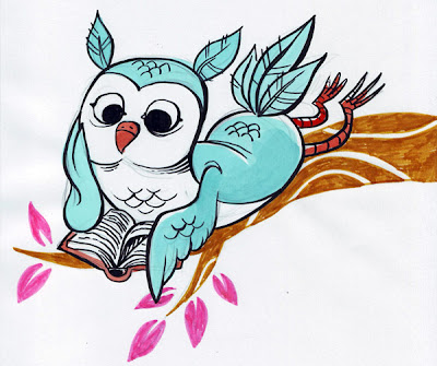
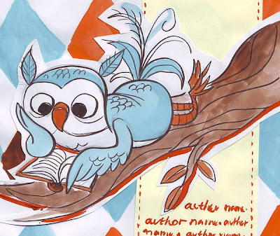
I chose blue and orange because I think they go beautifully together, and when faded, and combined with off-white, they have this awesome retro feel. The third owl was drawn first, and I liked it so I cut it out and used it in my (very) rough mock-up.


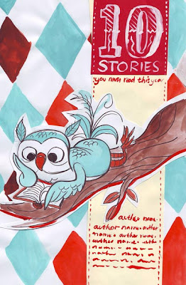
This is basically the design I've chosen, except there will be a few changes in the layout- firstly the diamond pattern here is too large and will be scaled down. Secondly, the area containing the title and authors will be moved over right up to the right side of the cover to simplify it a bit.

That's the front cover so far!