

Showing posts with label owls. Show all posts
Showing posts with label owls. Show all posts
Saturday, February 21, 2009
Book Cover Final
I think I'm pretty happy with it but it looks a bit tackier than I thought it would be. Sadly, I am not a fantastic designer, though I wish I was. Great design makes me happy.

Friday, February 20, 2009
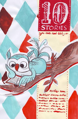
10 10 10!!!!
After a nice morning out shopping with mum, I did some more work on my Books Alive cover. The book's title is quite long - '10 Short Stories you Must Read This Year'. With a title like this, you really have to think a lot about hierarchy and the way the text is arranged on the page. If all of the text is treated equally, the importance of certain words is lost, and it doesn't have much of an impact on the viewer. If some of the text is too small or faint or hard to see, it becomes unbalanced and confusing.
The most important part of this title is '10', followed closely by 'short stories'. That's what this book is - a compilation of short stories, duh! Also, I placed emphasis on the word 'must'. Because it's a strong word and I felt I should treat it that way. And although it isn't capitolised, it's still stronger than the following words. You MUST read these stories. You must read these stories.
All that is left to do basically is the illustration of the owls, which I've decided will also be done in Photoshop. I really want to give this illo a real retro cartoon character look - solid, clean lines and sort of a silk-screen printed look.

This was a fun part - making the text pretty. For this design it was really imperitive that the title of the book was as much a piece of artwork as the rest of it. I used a cool font called 'Big Top' for the number 10, and then decorated it some more. They key to this is clever use of the Selection and Stroke tools:
- select the 10
- create a new layer
- modify > contract the selection by about 20 pixels or so
- use the Stroke tool, be sure the stroke is located INSIDE the selection
- repeat and experiment with various weights and colours
- and remember to create a new layer for each thing you do so you don't ruin anything you like!


Wednesday, February 18, 2009
Berty owl and friends
Here are a few of my favourite drawings I did today~ more owls, for my book cover. I am gonna go with the fat owl with the little reading owl on his head for my final piece!! Oh, and my classmates named the coloured one Berty. I thought it was a pretty neat name.


Tuesday, February 17, 2009
10 Short Stories you Must Read This Year
That's the name of the book we have to design a beautiful cover for. We don't know the authors, and we don't know anything about any of the stories in this book. All we know, is that we have to make something beautiful for the cover, and make it something that everyone will want to keep for years to come.
For my book I thought I'd come up with something relatively simple, inspired by modern graphic design, that featured a nice illustration of a character.
The most difficult part of this is making the character something that would appeal to all ages, and not just children - a cartoon with a vintage/classic quality, rather than something too young. So, I started by sketching some owls and deciding on a colour pallette.

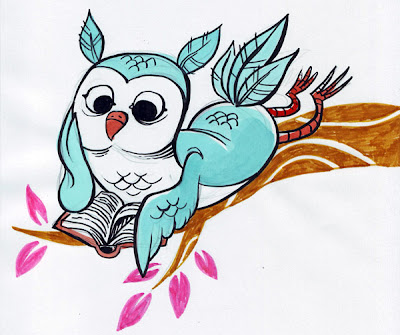
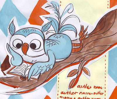
I chose blue and orange because I think they go beautifully together, and when faded, and combined with off-white, they have this awesome retro feel. The third owl was drawn first, and I liked it so I cut it out and used it in my (very) rough mock-up.
This is basically the design I've chosen, except there will be a few changes in the layout- firstly the diamond pattern here is too large and will be scaled down. Secondly, the area containing the title and authors will be moved over right up to the right side of the cover to simplify it a bit.
That's the front cover so far!
For my book I thought I'd come up with something relatively simple, inspired by modern graphic design, that featured a nice illustration of a character.
The most difficult part of this is making the character something that would appeal to all ages, and not just children - a cartoon with a vintage/classic quality, rather than something too young. So, I started by sketching some owls and deciding on a colour pallette.


I chose blue and orange because I think they go beautifully together, and when faded, and combined with off-white, they have this awesome retro feel. The third owl was drawn first, and I liked it so I cut it out and used it in my (very) rough mock-up.

This is basically the design I've chosen, except there will be a few changes in the layout- firstly the diamond pattern here is too large and will be scaled down. Secondly, the area containing the title and authors will be moved over right up to the right side of the cover to simplify it a bit.
That's the front cover so far!
Subscribe to:
Posts (Atom)

