
So a few weeks ago, I finally got my Diploma of Arts: Illustration. I'm now a certified illustrator! Woohoo!
Now, I can't think of why anyone would be hesitant about going to art school. With the exception of things like time and money, there's no reason not to do it if you want to become an illustrator (or anything really), no matter how old you are or your level of skills. I'd like to talk about some of the things that I appreciated about art school and what I got out of it.
Working in a studio environment
The first great thing that I can think of about going to art school is, of course, working with other art students! I shared my classrooms (it was two rooms joint together by a corridor) with 15-20 fellow artists and creatives, all with different styles, tastes and ways of seeing. We had the anime guy, the extremely cool dark fantasy/gothic chick, the photo-realism lady, the tattoo guy, the comics girl, you name it, someone in our class did it.
Even though we all had different ways of working and our art was totally different, being able to bounce ideas around, learn new techniques and voice different opinions about our own work or other artist's work was invaluable. It's rare to find such camaraderie anywhere else. And with 15-20 different points of view, you can get so much valuable feedback about your work that you probably wouldn't get from a community website such as DeviantArt, where people follow your work because it's the type of work they like.
And finally, 15-20 fellow artists means 15-20 different tastes in art, which leads to new and interesting artists and genres that you might not have ever known about before. Which is awesome!
The facilities
At school, you probably won't get access to the best facilities (your own studio space, computer, fancy art materials and goodies) until later. But even then, having easy access to photocopiers, scanners, books in the library, and a comfortable space to work just can't be beat.
I really miss having my own little studio area, though. It was great having my own big desk and my own wall for pinning up inspirational images and works in progress. Now that I am working on art mostly at home, it's been suprisingly difficult to adapt without having that nice big desk that you can tilt up at an angle, the photocopier just in the next room, and the library only a 30 second walk away. So when you're at art school, seriously, take advantage of all that stuff while you can.
Meeting local artists and illustrators
This year, I was extremely fortunate to have class meetings every fortnight with a working Melbourne artist. They talked about lots of different things - their work and process, what it's like working in the industry today, tips on how to get your work noticed. Something special that I gained from these meetings was learning about how many different roads one could take to becoming a professional illustrator, and the amount of possibilities there are for artists. Because really, anything that has type or an illustration on it - that was designed by somebody. That was illustrated by someone. This advertisement was the result of the work of lots of illustrators. I could go on and on!
The absolute best thing, however, was being able to see rough work and sketches, and hearing each artist talk about the steps that they take when creating a piece of work for a client. Ann James, a children's book illustrator, showed us tons of sketches and studies that she did while working on her latest illustrated book, Chester and Gil. The amount of research and drawing behind it was stunning.
Life drawing, and trying new things
Finally, being at art school means regular classes in life drawing and observational drawing. You're also sometimes forced to use unfamiliar mediums and methods of working, which is a good thing. These things are exercises that you would probably shy away from if you are at home teaching yourself.
Suprisingly, these classes are a great way to boost your creativity and spontineity. You can approach drawings in different ways, develop new ways of seeing, learn new techniques and try out new mediums. I mean, sure observational drawing sounds pretty boring, but it's so good for stretching those creative muscles.
Making the most of it
All of the above means nothing if you don't make the most of your time at art school. Prior to studying illustration, I did a course in Fine Art. But during that time, I didn't make the most of my time there. I was lazy, close-minded, stubborn and unproductive. So naturally, I didn't get much out of that course. Back then though, I didn't think that it was my fault.
When I look back, I can see that it was indeed my fault. You are responsible for your own experience. So, work hard, draw lots, ask lots of questions and have fun!
Showing posts with label illustration. Show all posts
Showing posts with label illustration. Show all posts
Tuesday, December 1, 2009
Tuesday, November 17, 2009
Business Cards!

A little while ago I was lucky enough to win a giveaway prize of 250 business cards from UPrinting! They arrived a few days ago and I couldn't be happier with them. I even managed to get 2 sides in full colour! The folks at UPrinting were very friendly and helpful and I'll definately be ordering some postcards and things from them soon.


 Also, here's a recent ink drawing I did!
Wednesday, November 11, 2009
Final school art show
My class's final show will be held at the Chisholm Institute of Tafe's Frankston campus, within the art department buildings. It's been a totally awesome year and I have learned so much and met some fantastic illustrators and creative people in the industry. I've also spent the year studying with a fine bunch of illustrators and artists who are totally awesome and I look forward to seeing their work out there in the world sometime soon!
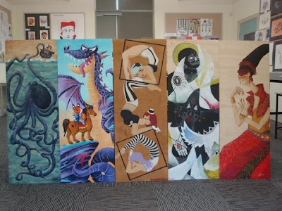
For our end of year show, some of us got to paint some big pieces of plywood to hang outdoors on the art department's walls. From left to right is the work of Lea Smithers, yours truly, Bonnie Eichelberger, Ben Lopez and Ashlea Bechaz.
Unfortunately I can't find a site with more of Lea's wonderful art on it, but if I find one I will update with a link.
Monday, October 26, 2009
New art and interview
I have been interviewed! Yaay! By Sneh Roy over at Little Box of Ideas. I talk about inspirations, animals, and dreams of becoming a Steve-Irwin like explorer. Check it out!
I have a couple of new drawings plus a digital commission I completed over the weekend. I'm kind of looking at a different sort of style at the moment, something a bit more realistic (but still cartoony and stylised of course!)
I have a couple of new drawings plus a digital commission I completed over the weekend. I'm kind of looking at a different sort of style at the moment, something a bit more realistic (but still cartoony and stylised of course!)


Sunday, October 18, 2009
Dragons


Today I made some dragons, and made another pattern with more dragons. I played with just flat colours instead of adding all the textures I usually do.
Tuesday, October 13, 2009
Jungle Cats!

The other day I read an article about how to create a seamless repeating pattern. This jungle cat pattern is my first go, I think it's okay, it could probably be more 'seamless' though!
Sunday, October 11, 2009
5 things I've learnt so far as a freelancing noob
In an effort to make the Bookish Owl a more entertaining and informative blog, I thought about all the things I've learnt in the last few months and decided to compile them into a list that might help other freelancing newbies out there. Keep in mind I'm still very much a freelancing noob, I still have a lot to learn, but here's 5 things I've learnt so far.
1. Folio presentation
It doesn't matter how good your work is, if it's presented woefully you probably won't impress anyone. How you present your work could be sort of a measure of how much you care about your work and how serious you are. Neatly presented pages of work printed on nice paper, inside an easy to open, sturdy and professional-looking portfolio is the way to go.
My portfolio is a monster from a store called Zetta Florence. It's a box/binder, about 8x11" in size, with mylar sleeves. Looking back now, the price I paid for it was probably a bit overkill, but it still looks good. You don't have to spend a fortune on yours but do be sure to invest in a good quality portfolio that will protect your work as well as making it look great.
Finally, the order of your work and the flow of your portfolio is definately something to consider. Don't jumble it up too much. For instance, I have all my digitally rendered pieces placed first (they also make up the majority of the work in my folio), mostly because this is the kind of work I prefer to do professionally. My digital work is followed by my greyscale ink work, and then paintings on paper.
I could probably write a whole blog post about this, but we need to move on!
2. Consistency
The thing that people commented on most about my portfolio was that it was extremely consistent and showed a lot of discipline. This sort of came as a suprise since I am still tweaking my 'style' with almost every piece I do, in order to try and get it right.
Consistency in your work is critical, especially if you are looking to illustrate children's picture books. You need to show that you can take one character, and draw him or her in many different ways while still maintaining the look of that character. Publishers want to see that you will be able to carry a character over a 20 or 30 something page book.
Maintaining your 'voice' in your work is important because it helps you form a 'brand' for yourself - it's your identity, what your work will be remembered for! It will make your work more easily recognisable as well.
3. Variety!
Wait.... what?? Mel, you just said my portfolio needs to be consistent! What are you smokin'?
Well sir, this means a couple of different things. And of course, it will all depend on who you are showing your folio to. For some markets, some of these might not be too relevent.
One art director suggested to me that it'd be a good idea to show examples of different styles. For children's books this is a good idea - you will probably get asked to do things in different styles, depending on the market that the project is intended for. It also is a way of demonstrating your drawing skill.
Variety in the subject matter of your work will impress your potential clients and employers. Show them that you can draw lots of different things, different moods.
4. Typography is just awesome
My class held an exhibition in Prahan about a month ago. One night, we had an 'industry night' where art directors, illustrators, agents and other professionals in the creative industry viewed our work and portfolios. In general, they were particularly impressed by the students who intergrated typography into their illustrations successfully. It seems to be a bit of an underrated area in illustration, and seen as more of a design thing. But making typography INTO illustration is simply, really, really awesome.
It may not work for everybody, and may not be very relevent for some markets. But I believe that having one or two pieces of work featuring great typography will really strengthen your portfolio and impress your potential employers and clients.
5. Art directors and agents aren't all that scary
They're just people like you and me, you know? Well, some of them might be a bit intimidating. They're probably working under tight deadlines or something. But most that I have met have been pretty friendly and very happy to give me feedback about my work.
What about criticism? Yeah, it can be tough - but don't immediatly think that any criticism is made due to your work being bad. There's a number of reasons why employers/clients/agents might criticise your work:
If someone is not interested in your work, or doesn't think you are good enough for professional work, they will most likely tell you. But don't get disheartened. Just work hard, study hard, and LOOK at the work that these publishers and agencies are putting out there.
Well, I hope you enjoyed reading this and I hope it becomes useful for someone out there. These are all my opinions, by the way - if you have anything to add, or if you disagree about something I have said, feel free to leave a comment and have your say!
 Also just thought I'd sneak this in, it's NEW LOGO TIME! My work has evolved a bit so I wanted a new image for my site and business cards to reflect my new and improved work.
1. Folio presentation
It doesn't matter how good your work is, if it's presented woefully you probably won't impress anyone. How you present your work could be sort of a measure of how much you care about your work and how serious you are. Neatly presented pages of work printed on nice paper, inside an easy to open, sturdy and professional-looking portfolio is the way to go.
My portfolio is a monster from a store called Zetta Florence. It's a box/binder, about 8x11" in size, with mylar sleeves. Looking back now, the price I paid for it was probably a bit overkill, but it still looks good. You don't have to spend a fortune on yours but do be sure to invest in a good quality portfolio that will protect your work as well as making it look great.
Finally, the order of your work and the flow of your portfolio is definately something to consider. Don't jumble it up too much. For instance, I have all my digitally rendered pieces placed first (they also make up the majority of the work in my folio), mostly because this is the kind of work I prefer to do professionally. My digital work is followed by my greyscale ink work, and then paintings on paper.
I could probably write a whole blog post about this, but we need to move on!
2. Consistency
The thing that people commented on most about my portfolio was that it was extremely consistent and showed a lot of discipline. This sort of came as a suprise since I am still tweaking my 'style' with almost every piece I do, in order to try and get it right.
Consistency in your work is critical, especially if you are looking to illustrate children's picture books. You need to show that you can take one character, and draw him or her in many different ways while still maintaining the look of that character. Publishers want to see that you will be able to carry a character over a 20 or 30 something page book.
Maintaining your 'voice' in your work is important because it helps you form a 'brand' for yourself - it's your identity, what your work will be remembered for! It will make your work more easily recognisable as well.
3. Variety!
Wait.... what?? Mel, you just said my portfolio needs to be consistent! What are you smokin'?
Well sir, this means a couple of different things. And of course, it will all depend on who you are showing your folio to. For some markets, some of these might not be too relevent.
One art director suggested to me that it'd be a good idea to show examples of different styles. For children's books this is a good idea - you will probably get asked to do things in different styles, depending on the market that the project is intended for. It also is a way of demonstrating your drawing skill.
Variety in the subject matter of your work will impress your potential clients and employers. Show them that you can draw lots of different things, different moods.
4. Typography is just awesome
My class held an exhibition in Prahan about a month ago. One night, we had an 'industry night' where art directors, illustrators, agents and other professionals in the creative industry viewed our work and portfolios. In general, they were particularly impressed by the students who intergrated typography into their illustrations successfully. It seems to be a bit of an underrated area in illustration, and seen as more of a design thing. But making typography INTO illustration is simply, really, really awesome.
It may not work for everybody, and may not be very relevent for some markets. But I believe that having one or two pieces of work featuring great typography will really strengthen your portfolio and impress your potential employers and clients.
5. Art directors and agents aren't all that scary
They're just people like you and me, you know? Well, some of them might be a bit intimidating. They're probably working under tight deadlines or something. But most that I have met have been pretty friendly and very happy to give me feedback about my work.
What about criticism? Yeah, it can be tough - but don't immediatly think that any criticism is made due to your work being bad. There's a number of reasons why employers/clients/agents might criticise your work:
- It might not be what they are looking for, or the kind of style/genre that they deal with.
- It might no be appropriate for the particular market they want to sell to.
- It simply may not be their particular cup of tea. Like everyone else, art directors and agents have tastes of their own.
- Your work is good, but needs to improve more to be of a professional standard. You might not be ready for professional work just yet.
If someone is not interested in your work, or doesn't think you are good enough for professional work, they will most likely tell you. But don't get disheartened. Just work hard, study hard, and LOOK at the work that these publishers and agencies are putting out there.
Well, I hope you enjoyed reading this and I hope it becomes useful for someone out there. These are all my opinions, by the way - if you have anything to add, or if you disagree about something I have said, feel free to leave a comment and have your say!
 Also just thought I'd sneak this in, it's NEW LOGO TIME! My work has evolved a bit so I wanted a new image for my site and business cards to reflect my new and improved work.
Friday, September 4, 2009
Numbers, croc teeth and one lovely lady
WHEW! Busy busy busy busy busy. All of these are Photoshop, with the exception of the lady, who was painted with gouache on pastel paper.
Illustre was great! So much wonderful work. I met some really awesome illustrators and designers from NMIT and met some people from the industry too. I even managed to sell a few pieces and win an award! Wooohoo!!
Best of all though, I met someone who was very interested in my work. And I am going to see them on Tuesday and show them my portfolio. So I am very excited and super nervous as well, but it's so cool. I am one very happy illustrator right now!!
Will post more soon, but for now, back to work!


Wednesday, August 26, 2009

Thursday, August 20, 2009
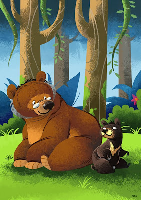
My beary good friend

Uh oh! Better keep out of this angry bull's way.... I drew him to go with my happiness bear. I'm also going to do a pelican and a wolf.


Also, I'm doing a series of black and white ink drawings for my portfolio.
The theme I chose for the first few drawings is a story about a boy who wants a pet- but he doesn't want a boring cat or an annoying yappy dog. He wants something FEROCIOUS - a lion, or a tiger, or a crocodile....
One day while on his lengthy walk home, he finds a bear. Next to the bear is a sign saying 'freE BEaR'. Could he have finally gotten his wish...??
Tuesday, August 18, 2009
Alice and the Gryphon and the Mockturtle
Quick update, finished a painting last week, I decided I wanted to do a scene from Alice in Wonderland, of two slightly underappreciated characters as well. Sorry the colour scan is pretty terrible, I need to get onto getting a better scanner or something Ugh!


I also did this bear, who stands proudly on the front of my new business cards, which I should be recieving tomorrow. Hoo-rah!

I'm also updating my links to the right. More artists!


I also did this bear, who stands proudly on the front of my new business cards, which I should be recieving tomorrow. Hoo-rah!

I'm also updating my links to the right. More artists!
Wednesday, July 8, 2009
Zebracorn

Fun little image I'm doing for a series of little promotional cards. I was originally going to paint it but, for some reason I ended up doing it in Photoshop instead. I think I've been agonising way too much over these pieces and want to get them out of the way quickly.
I showed this to a friend who liked it, but mentioned that the girl's pants blended in a bit much and were hard to make out. So I did a little bit of a colour change and the difference is huge!

Looks a lot better I think!
I uploaded the colour rough before, but just thought I'd show it again.

Tuesday, June 30, 2009
Boa Lady

I am thinking I'd like to jazz up my website a bit. Maybe with a bit of artwork for the title of each page. This lady is an idea for one such artwork, inspired by the Dr Sketchy's session I went to last week.
Some things!
Been busy lately but here's a few rough thingies I've slowly been working on, some assignments and commissions.


Sunday, June 21, 2009
Patchwork Lion + website is online!

Here's a quick pic I did in class today. I had a lot of fun experimenting and playing with fabric and patterned textures! I also decided I have too many tigers, crocodiles and bears, so I figured it'd be nice to do a different animal for a change. In this case, a ferocious circus lion who looks more like a plush doll... teehee.
Also, in other news, my website Bearprints.com.au is online! Hoo-rah!!
Tuesday, June 16, 2009
Hello!

Just a sketch I did during class today that I really liked and decided to scan! It's a bit different from my usual stuff too! I rather enjoy using gouache like watercolour. It kind of feels like watercolour but I have more control over it.
Saturday, June 13, 2009
Bearosel

This is a piece I made just to go on the front page of my website. I've done about 3 or 4 different designs for Bearprints, but in the end I opted for something really simple and easy to navigate, with the art governing the overall look and design. Anyway, I wanted a piece to go on the front page of my site for the launch, I wanted something cute, fun, and featuring a bear. I wanted to throw in a tiger too, so after a bit of scribbling in photoshop I came up with this.

This is about as neat as my sketches get. After this stage I do flat colours and details, and once everything is sorted I move on to adding texture. I was going to upload an example of just the flat coloured stage, but I stupidly saved both of my working files as flattened finals. Oops!
My website Bearprints will probably be online within a week or two. (Yeah, I've heard that before, but this time I really mean it!)
Thursday, June 4, 2009
Red and Blue and Yellow
No inspiration Thursday this week, just a few more pieces from me. Yesterday we went to the city and met Matte Clare, an illustrator who is also heavily involved in Illustrators Australia. He had a lot of good stuff for us, and he showed us a bit of his work. He does a lot of illo's for business magazine articles and editorials and stuff, and it was really inspiring to learn about. I think it might be an avenue I will look into.
I have one more drawing to redo, then I have to pack it all up and deliver all my work in tomorrow for assessment. I've been pretty stressed in the past week but I have it pretty much under control now, I think. Before I head in tomorrow morning I'm going to celebrate with a yummy bacon and egg breakfast down at the café near the train station. Yay!


Here are the second and third pieces for the character illustration assignment. Far better than my old attempt. Here we have my character, the red croc, meeting a blue tiger, and then both of them interacting with an object - a vehicle. I'm pretty happy with all 3 and they are all pieces I would be happy to see in the end of year exhibition.
Well, back to work I go!
Saturday, May 30, 2009
Red Croc
I've had a really, really frustrating week of artmaking, let me tell you. I've been stressing out all week because the piece I was working on for our latest illustration assignment just was not getting up to par. I couldn't hand that thing in as part of my portfolio, nor would I ever want it shown in the Illustre exhibition. So I am doing it over again digitally.
Also in the works is a resubmission for a previous assignment, where we had to illustrate 3 characters. Despite the high mark I got for those pieces I am not happy with them and I am doing that assignment over again as well.
So here are the three sketches I will end up painting. The character is still a crocodile but he is drawn in my main style and he has a bit more personality to him. He's also red!


My first painting attempt was so bad that I couldn't even look at the thing, so I scribbled over it and threw it out. My second attempt was not much better, but I kept it this time. The problem I had with these ones is the paper, I reckon. It's canvas paper for oils and acrylics and I don't think gouache seems to work well on it at all. I like texture in my paintings too, but this paper was probably too much.

Tired and frustrated after two disasters, I decided to put the brushes away for the day and play some Warcraft. Yesterday's attempt at painting was much better, thankfully! This time I painted on pastel paper much like I did with this piece. Despite a little blooper which ended up being a background, it went well and I was pretty happy afterwards. I had redeemed myself. Now, I just need to go to the shop and buy some more white gouache, because I am all out! Doh!

Friday, May 22, 2009
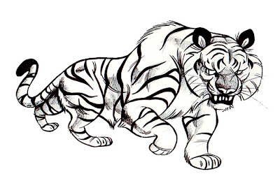
Tiger head
 I feel like I need to do more work in Illustrator and get good at doing vector illustrations, so here's a 10 minute tiger head for a bit of pre-bed practice. RAWR!
Subscribe to:
Posts (Atom)

