Saturday, October 31, 2009
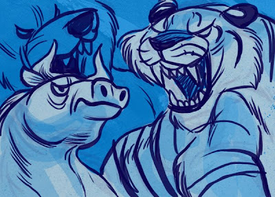
Beasties
I've had a bit of a frustrating day today, and I think the lesson learned is to remember the number 1 reason why we draw and paint in the first place: for ourselves. I have a painting that is stumping me at the moment and for a good chunk of the day I've been pouring over other artist's work searching for inspiration and guidance. And as I kept returning to the drawing board all I had was feelings of inadequacy and self doubt.
Even though I'm working on my portfolio, finishing up my schoolwork and determined to get somewhat close to having an 'industry standard' level of work, I often forget why I do it at all. Because I love it, I enjoy it and it's my identity. It's a part of me.
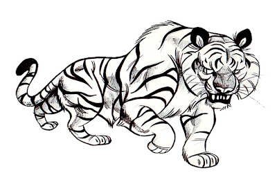
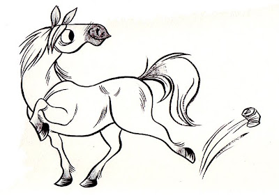
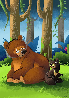
All you can do in times like these is work through it and keep drawing. I sketched up a few beasties in Photoshop and decided I liked them enough to post them!
Monday, October 26, 2009
New art and interview
I have been interviewed! Yaay! By Sneh Roy over at Little Box of Ideas. I talk about inspirations, animals, and dreams of becoming a Steve-Irwin like explorer. Check it out!
I have a couple of new drawings plus a digital commission I completed over the weekend. I'm kind of looking at a different sort of style at the moment, something a bit more realistic (but still cartoony and stylised of course!)
Sunday, October 18, 2009
Dragons
Friday, October 16, 2009
Partytime
Tuesday, October 13, 2009
Jungle Cats!
Sunday, October 11, 2009
5 things I've learnt so far as a freelancing noob
In an effort to make the Bookish Owl a more entertaining and informative blog, I thought about all the things I've learnt in the last few months and decided to compile them into a list that might help other freelancing newbies out there. Keep in mind I'm still very much a freelancing noob, I still have a lot to learn, but here's 5 things I've learnt so far.
1. Folio presentation
It doesn't matter how good your work is, if it's presented woefully you probably won't impress anyone. How you present your work could be sort of a measure of how much you care about your work and how serious you are. Neatly presented pages of work printed on nice paper, inside an easy to open, sturdy and professional-looking portfolio is the way to go.
My portfolio is a monster from a store called Zetta Florence. It's a box/binder, about 8x11" in size, with mylar sleeves. Looking back now, the price I paid for it was probably a bit overkill, but it still looks good. You don't have to spend a fortune on yours but do be sure to invest in a good quality portfolio that will protect your work as well as making it look great.
Finally, the order of your work and the flow of your portfolio is definately something to consider. Don't jumble it up too much. For instance, I have all my digitally rendered pieces placed first (they also make up the majority of the work in my folio), mostly because this is the kind of work I prefer to do professionally. My digital work is followed by my greyscale ink work, and then paintings on paper.
I could probably write a whole blog post about this, but we need to move on!
2. Consistency
The thing that people commented on most about my portfolio was that it was extremely consistent and showed a lot of discipline. This sort of came as a suprise since I am still tweaking my 'style' with almost every piece I do, in order to try and get it right.
Consistency in your work is critical, especially if you are looking to illustrate children's picture books. You need to show that you can take one character, and draw him or her in many different ways while still maintaining the look of that character. Publishers want to see that you will be able to carry a character over a 20 or 30 something page book.
Maintaining your 'voice' in your work is important because it helps you form a 'brand' for yourself - it's your identity, what your work will be remembered for! It will make your work more easily recognisable as well.
3. Variety!
Wait.... what?? Mel, you just said my portfolio needs to be consistent! What are you smokin'?
Well sir, this means a couple of different things. And of course, it will all depend on who you are showing your folio to. For some markets, some of these might not be too relevent.
One art director suggested to me that it'd be a good idea to show examples of different styles. For children's books this is a good idea - you will probably get asked to do things in different styles, depending on the market that the project is intended for. It also is a way of demonstrating your drawing skill.
Variety in the subject matter of your work will impress your potential clients and employers. Show them that you can draw lots of different things, different moods.
4. Typography is just awesome
My class held an exhibition in Prahan about a month ago. One night, we had an 'industry night' where art directors, illustrators, agents and other professionals in the creative industry viewed our work and portfolios. In general, they were particularly impressed by the students who intergrated typography into their illustrations successfully. It seems to be a bit of an underrated area in illustration, and seen as more of a design thing. But making typography INTO illustration is simply, really, really awesome.
It may not work for everybody, and may not be very relevent for some markets. But I believe that having one or two pieces of work featuring great typography will really strengthen your portfolio and impress your potential employers and clients.
5. Art directors and agents aren't all that scary
They're just people like you and me, you know? Well, some of them might be a bit intimidating. They're probably working under tight deadlines or something. But most that I have met have been pretty friendly and very happy to give me feedback about my work.
What about criticism? Yeah, it can be tough - but don't immediatly think that any criticism is made due to your work being bad. There's a number of reasons why employers/clients/agents might criticise your work:
If someone is not interested in your work, or doesn't think you are good enough for professional work, they will most likely tell you. But don't get disheartened. Just work hard, study hard, and LOOK at the work that these publishers and agencies are putting out there.
Well, I hope you enjoyed reading this and I hope it becomes useful for someone out there. These are all my opinions, by the way - if you have anything to add, or if you disagree about something I have said, feel free to leave a comment and have your say!
Also just thought I'd sneak this in, it's NEW LOGO TIME! My work has evolved a bit so I wanted a new image for my site and business cards to reflect my new and improved work.
1. Folio presentation
It doesn't matter how good your work is, if it's presented woefully you probably won't impress anyone. How you present your work could be sort of a measure of how much you care about your work and how serious you are. Neatly presented pages of work printed on nice paper, inside an easy to open, sturdy and professional-looking portfolio is the way to go.
My portfolio is a monster from a store called Zetta Florence. It's a box/binder, about 8x11" in size, with mylar sleeves. Looking back now, the price I paid for it was probably a bit overkill, but it still looks good. You don't have to spend a fortune on yours but do be sure to invest in a good quality portfolio that will protect your work as well as making it look great.
Finally, the order of your work and the flow of your portfolio is definately something to consider. Don't jumble it up too much. For instance, I have all my digitally rendered pieces placed first (they also make up the majority of the work in my folio), mostly because this is the kind of work I prefer to do professionally. My digital work is followed by my greyscale ink work, and then paintings on paper.
I could probably write a whole blog post about this, but we need to move on!
2. Consistency
The thing that people commented on most about my portfolio was that it was extremely consistent and showed a lot of discipline. This sort of came as a suprise since I am still tweaking my 'style' with almost every piece I do, in order to try and get it right.
Consistency in your work is critical, especially if you are looking to illustrate children's picture books. You need to show that you can take one character, and draw him or her in many different ways while still maintaining the look of that character. Publishers want to see that you will be able to carry a character over a 20 or 30 something page book.
Maintaining your 'voice' in your work is important because it helps you form a 'brand' for yourself - it's your identity, what your work will be remembered for! It will make your work more easily recognisable as well.
3. Variety!
Wait.... what?? Mel, you just said my portfolio needs to be consistent! What are you smokin'?
Well sir, this means a couple of different things. And of course, it will all depend on who you are showing your folio to. For some markets, some of these might not be too relevent.
One art director suggested to me that it'd be a good idea to show examples of different styles. For children's books this is a good idea - you will probably get asked to do things in different styles, depending on the market that the project is intended for. It also is a way of demonstrating your drawing skill.
Variety in the subject matter of your work will impress your potential clients and employers. Show them that you can draw lots of different things, different moods.
4. Typography is just awesome
My class held an exhibition in Prahan about a month ago. One night, we had an 'industry night' where art directors, illustrators, agents and other professionals in the creative industry viewed our work and portfolios. In general, they were particularly impressed by the students who intergrated typography into their illustrations successfully. It seems to be a bit of an underrated area in illustration, and seen as more of a design thing. But making typography INTO illustration is simply, really, really awesome.
It may not work for everybody, and may not be very relevent for some markets. But I believe that having one or two pieces of work featuring great typography will really strengthen your portfolio and impress your potential employers and clients.
5. Art directors and agents aren't all that scary
They're just people like you and me, you know? Well, some of them might be a bit intimidating. They're probably working under tight deadlines or something. But most that I have met have been pretty friendly and very happy to give me feedback about my work.
What about criticism? Yeah, it can be tough - but don't immediatly think that any criticism is made due to your work being bad. There's a number of reasons why employers/clients/agents might criticise your work:
- It might not be what they are looking for, or the kind of style/genre that they deal with.
- It might no be appropriate for the particular market they want to sell to.
- It simply may not be their particular cup of tea. Like everyone else, art directors and agents have tastes of their own.
- Your work is good, but needs to improve more to be of a professional standard. You might not be ready for professional work just yet.
If someone is not interested in your work, or doesn't think you are good enough for professional work, they will most likely tell you. But don't get disheartened. Just work hard, study hard, and LOOK at the work that these publishers and agencies are putting out there.
Well, I hope you enjoyed reading this and I hope it becomes useful for someone out there. These are all my opinions, by the way - if you have anything to add, or if you disagree about something I have said, feel free to leave a comment and have your say!
Also just thought I'd sneak this in, it's NEW LOGO TIME! My work has evolved a bit so I wanted a new image for my site and business cards to reflect my new and improved work.
Saturday, October 10, 2009
Podcasts
Today I have been listening to a lot of podcasts. The amount of information on some of the ones I've listened to is simply astounding and I've been sucking it all up like a sponge. I also seem to hold more value in the spoken word, as opposed to freelancing/illustration advice typed up on a blog or site. It's just more personal, or something. They are also entertaining and have some pretty funny moments!
So here are some awesome podcast sites I've been listening too.
Freelance Radio - a great series of podcasts for freelancers of all kinds, whether you're a writer, an illustrator, a programmer or whatever.
Escape from Illustration Island - cool collection of podcasts, I've only listened to a few of these but they're awesome.
Artcast by Stephen Silver - Stephen covers a wide range of topics but a lot of his podcasts are about keeping motivated, getting inspiration and really involving yourself in your craft.
I hope you enjoy listening to them as much as I do.
Wednesday, October 7, 2009
Tuesday, October 6, 2009
Even more progress
Characters blocked in with a little bit of texture added.
Just about finished except for a few minor details. However the mama tiger's face is looking very odd so I think I will paint over it and fix it up.
I'm also noticing some mistakes and it's too late to save them, for instance, the dragon's fire is lighting up the mountains far in the distance... and well, I guess it's just one huge dragon. Or maybe they're not mountains, but just little hills that aren't too far away? Oh dear.
Monday, October 5, 2009
More progress
Saturday, October 3, 2009
Painting in progress! Oh yeah!
I am painting! Just enjoying my last day off until I have to sit down and churn stuff out for the final month of my schooling. Here's a photo of my 'studio', or, erm, workspace I guess. My brother is off taking over the world starting with England so I am borrowing his room for my own fiendish purposes.
It's very cramped up as you can see and it's not the most comfy place to work but it's okay. I'm right handed so I have to be careful not to drip water all over my paintings while I work. Silly me!
While I'm messing around with the camera I figured I'd take some progress shots of my new painting. It's a commission! Here's the first bit.
I start with the background and just block everything in. This is about A3 size on watercolour paper, painting with gouache, by the way. It's yumtacular!
Next bit. The moon is looking a little funny so I will have to fix that at some point. But I can't get too caught up in little details just yet, so I must move on!
And here it is as it is now, with most of the background blocked in and a little bit textured.
I'll keep updating with new photos as I go along. So far, this is about 3 hours of work. The next step is to finish all the drybrushing in the sky, mountains and ground. Then I will fill in the foreground, and start filling in the colours of the characters. Details are added at the very very very end.
Anyway, I hope this is somewhat helpful somehow.
Subscribe to:
Posts (Atom)